LOOP Village marketing
website redesign
Loop Village is an innovative online platform designed to help seniors stay socially connected and engaged, particularly in response to the isolation that many older adults experience. The platform provides a safe, interactive virtual community where seniors can participate in live events, classes, and social gatherings.
As an intern with LOOP Village, I took on the task of redesigning the marketing website to be more accessible and effective. The following page displays my audit of the existing web and its flaws followed by my suggestions and redesigned website layout.
Design Practices Guiding Audit Decisions
Adhere to at least WCAG AA and Section 508 to ensure usability for users with disabilities, including adequate text-background contrast
Provide enough space between buttons to prevent accidental clicks and ensure text/buttons are large enough for easy interaction
Enable text enlargement without layout issues and compatibility with screen readers
Avoid distractions like pop-ups or animations
Present information in organized sections with left-aligned text for easier reading

Click to open study outlining best practices for designing for older adults
Design Audit and Redesigned Components
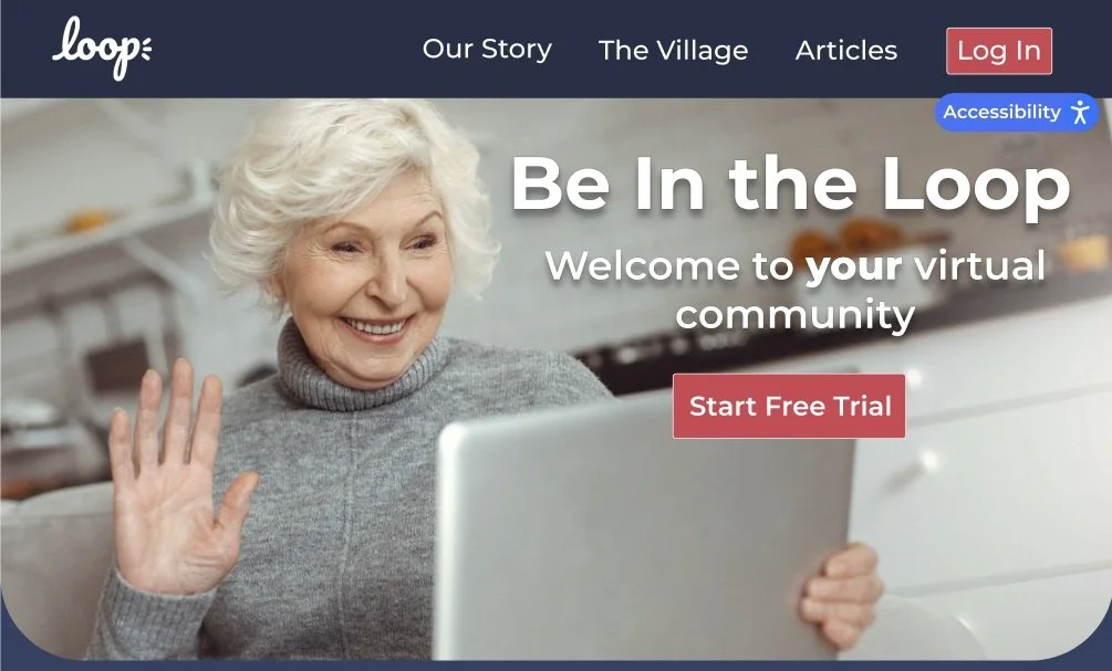
Header, Accessibility, & Hero Image
Original

Issues and Improvements:
Navigation: Original labels were vague and membership CTAs were redundant, renamed to "Our Story" and "The Village" for clarity and consolidated sign-up actions into one
Login: No personalization for returning users, added a login button that updates to show the user's name once signed in
Accessibility Icon: Icon alone wasn't self-explanatory, replaced with a labeled "Accessibility" pill so users immediately know what it does
Hero Image & Contrast: Low contrast and parallax scrolling made the page hard to read and distracting, warmed up the image, added text shadow and border to pass WCAG AA, and switched to a static image
Call to Action: "Learn more about LOOP" was too passive, replaced with a prompt to start a free trial for stronger engagement
Buttons: Buttons were too small and hard to interact with, increased size and used larger, bolded fonts throughout
Header: No clear visual separation between the header and page body, switched to a slightly darker navy to subtly distinguish the two sections
Video
Border: A simple, rounded red square adds visual interest without overwhelming the content or distracting from the video
Heading: "Learn More About Loop" clearly signals what the section is about, with text contrast that passes WCAG AA
Video: Large, embedded YouTube player keeps things familiar and easy to use, letting the video's message speak for itself


Redesign
Same for Original and Redesign

What LOOP Provides Its Users
Original

Issues and Improvements:
Bullet Points: The original format made it hard to connect the key info to the intro above it, restructured with icons to make each point more intuitive and easier to scan
Feature Pages: Fully built pages for Companionship and Cafe were buried, and high-contrast buttons that link directly to each feature page alongside the existing Events page
Graphic: Original graphic felt disconnected from the rest of the section and pulled focus from LOOP's core selling points, removed to keep attention on what matters
Introduction: The original intro was wordy and harder to parse, simplified the copy so the whole section is quicker to understand at a glance
Redesign

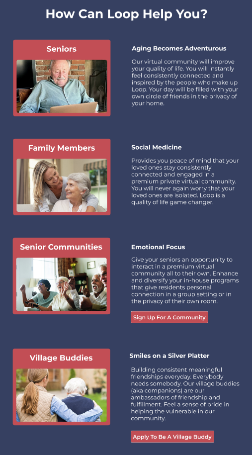
How Does LOOP Help Different Demographics

Issues and Improvements:
Layout & Text: Horizontal format with centered text made the section feel chaotic and hard to read, restructured vertically with left-aligned text and larger font to reduce cognitive load and improve readability
Personalization: Content felt generic, reorganized to speak more directly to each group so seniors and Village Buddies each feel individually addressed and supported
Terminology & Clarity: "Companions" was inconsistent with the rest of the platform, updated to "Village Buddy" and expanded the description to better explain what the role is and how it helps
Sign Up Buttons: No clear next step for non-seniors looking to join, added group-specific sign-up buttons that link directly to the respective registration forms
Original
Redesign
Process to Join Loop
Original

Issues and Improvements:
Title & Text: "How It Works" was vague and the small, centered text made it hard to read, rewrote the title to be more descriptive and switched to larger, left-aligned text with key details emphasized
Structure: No clear indication of order made the steps confusing to follow, added numbered tiles and reorganized the content to reflect the most intuitive sequence for joining LOOP Village
CTA Placement: The main sign-up button was buried halfway down the page, moved higher to capture attention earlier and drive engagement
Redesign

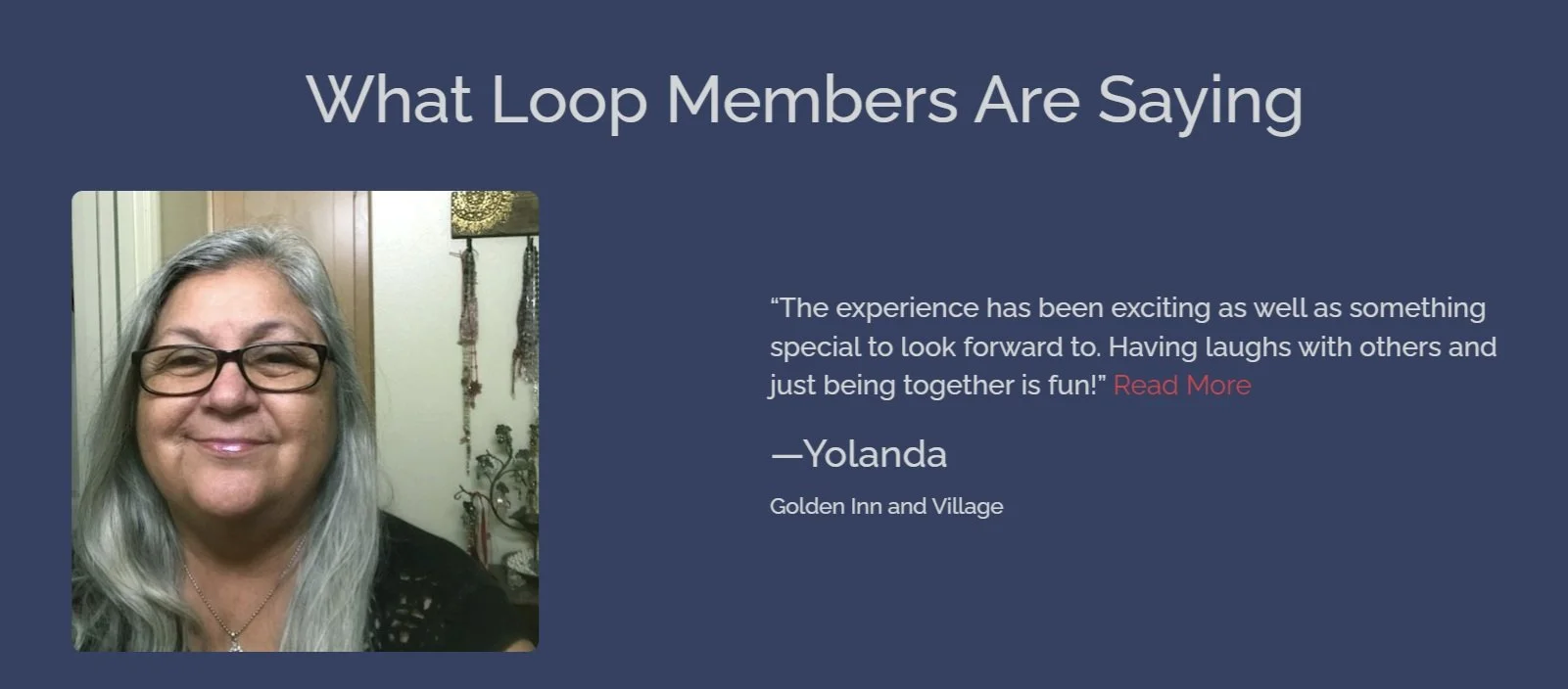
Testimonials
Redesigned Testimonial
Issues and Improvements:
Text & Contrast: Small font and red "Read More" links failed WCAG AA contrast requirements, increased font size, and updated link colors to meet accessibility standards
Hard to Read More: Users must click on the read more link, which brings the user to a full page with a bunch of these individual testimonials, but unclear if it’s to read more testimonials or read more about what an individual has to say
Navigation: The "Read More Testimonials" button just repeated the same seven testimonials already on the page, replaced with interactive arrows so users can browse through testimonials without cluttering the layout
Credibility: No context was given for who the testimonials were from, added a label identifying each person as a "Loop Villager" to establish their connection to LOOP and add credibility
Original Individual Testimonial

Footer and Bottom Navigation

Original
Ending Hero Image
Issues and Improvements:
Social Media Icons: Icons were too close together and easy to misclick, added more spacing between them to reduce errors
Bottom Navigation: The fixed bottom nav took up over an eighth of the screen while scrolling, which is a pattern better suited for mobile apps than websites, removed it and moved the relevant contact info elsewhere on the page
Footer Color: Used a slightly darker navy to subtly signal to users that the footer serves a different purpose from the rest of the page, consistent with the same approach used in the header

Full Events Page
< Inaccessible Hover State
Redesign
Problems With Section
Image Contrast: The hero image didn't meet WCAG AA requirements, making text over it hard to read
Parallax Scrolling: The scrolling effect was distracting and detracted from the overall experience
Tagline: "Get in the loop" is a strong tagline and has been carried into the redesigned hero image variants
Sections From Original Site Which Were Omited From Redesign
Problems With Section
Graphic: The background graphic failed WCAG AA contrast requirements
Redundant Button: "Explore Now" linked to the same page as the earlier "Explore Events" button, removed to eliminate redundancy and simplify the user journey
Hover State: Button text became hard to read on hover, updated the hover state to maintain legibility and meet accessibility standards


